Sunday, November 10, 2013

art gallery #2

Step 1
1.)  The title for the exhibit was Burchfield.
2.) Casting of works along with the space with which he created his art work in.

Step 2
1.) The lighting i thought was dim and kept low  to give that older in time feel to the art works.
2.) White was the olor used on the walls, but just seemed darker because of the lighting.
3.) The architecture was just normal walls, except for one which made it seem like the viewer was looking through a wall of his studio.
4.) The movement was paced out evenly i thought, well spaced out giving viewers time to take in each piece and not feel rushed to view the next.

Step 3
1.) The art work was organized by the different artists.
2.) Art works are similar because of the material with which they were crafted from.
3.) The art works are different because of the artists ideas, thoughts, materials, and ideas conveyed in the pieces.
4.) Some of the works are framed in wood, but three dimensional often rested on some sort of base to be displayed.
5.) Artworks are identified with a little tag next to them with there title, artist, material, and when they were created.
6.) The artworks proximity is probably ten feet apart, giving you a more open space to view at a steady pace and not rushed by others.


Artist: William Keyser
Title: Pretzel II
Media: gum wood
Date:2013
Description- To me this piece reminds me of a center piece for a dinning table and since I like wood work so much it makes me want to create something just like it on my own.
Formal Analysis- This piece has line, shape, and space all in it because of the straight but different layers in the piece itself.
Interpretation- The artist probably wanted to show how nature is wrapped around itself and always continuing no matter what way it is forced in.


Artist: Mitchell Messina
Title: #7 Extension
Media: clay, wood and pigment
Date: 2013
Description: A person is holding a ladder which could possibly be to support others.
Formal Analysis: line is the biggest one in this based on the long ladder which draws the viewer to the person on top.
Bracketing: This piece reminds me most of a ladder because it is the largest part in it.
Interpretation: I feel as if this work is to symbolize the person helping others get to the top and be all they can be.

Artist: Dan Mirer
Title: Knob Top Jars
Media: Blown glass and silver foil
Date: 2011
Description: to me, these pieces of glass mostly resemble a water drop.
Formal Analysis: Shape is a great one with the two spheres and straight part connecting the two.
Bracketing: This piece reminds me of a rain drop from the beging, like one in a pool of water.
Interpretation: I feel the artist was trying to show the union of two seperate pieces together as one.


4.) Overall I liked the experience of looking at things in a different way and how the space could also affect a piece of art as well.

Saturday, November 9, 2013

mod #11 video blog

1.)  I selected these two videos because of there relation to the two topics in the text which interested me the most. I felt that both the Surrealism and Expressionism were great sections of this chapter and could relate to the most in my visits to art galleries.

2.) In the Dada and Surrealism it was interesting with the abstract touch to all scenes were unique and creative, also the signs in them had thought and emotions given to the viewers. For the Expressionism, colors and emotions were the emphasis on paintings. While they also payed attention to detail especially using dark and light areas to bring out things.

3.) These videos relate to readings by expanding the information read in the small parts of it in order to give the reader a better interpretation. Also the displaying of more art that can help explain the style of art being talked about in each section.

4.) I felt these films were pretty decent, little length to keep some peoples attention span because of the amount of information in them. However, they are still a great way for students to get a better grasp of some styles they may find very interesting to them.

Sunday, November 3, 2013

masks


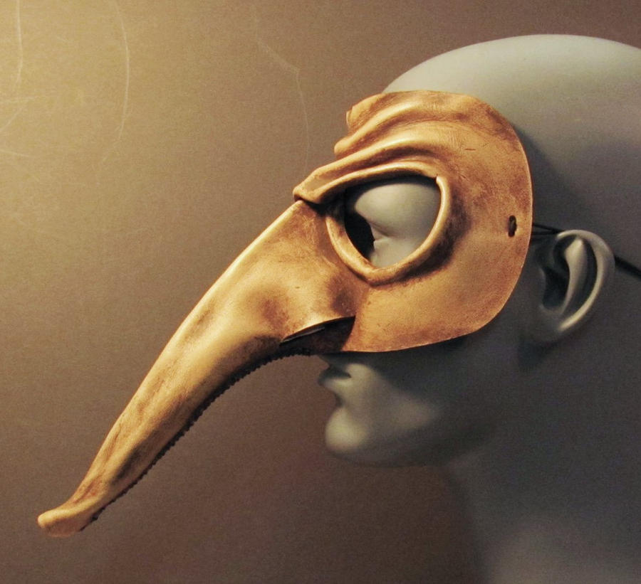
1. I selected these mask because of the extremely exaggerated nose, the long tall face and jaw-like structure and the dark hollowed out looking eyes.

2. The nose provides a large segment of space since it is such a long feature. Then the texture of the stone looking mask made me want to incorporate a texture like the plaid which I felt would be really cool to try and replicate. Then the lines of the jaw in last mask makes you check out the physical features of the mouth. as well as the value in the dark eyes.

20131103_222012.jpg20131103_224855.jpg

4. My mask I gave the textured look with the plaid in that when you see that pattern you often think of the shirts and how it feels. Even shape in the eyes and mouth with the total blackness of them both. and the shape of the nose that is 3-D. Along with the line crossing through the entire face and into the empty face on the one side of the face.

4. Overall, I am very satisfied with this mask and the way it turned out from the original design in my head. I liked how my plaid pattern turned out on the top of the head. I definitely had a fun experience in creating this along with the three dimensional nose since I would never thing of creating a mask on a normal day.

Saturday, November 2, 2013

mod #10 video

1. I selected the African Art since we have to do a mask which I know Africans have used masks for ritual and religious events. The Buddhism video only to learn a little more about monk's and the way they live.

2. The key things I learned in the African video was how early art was primitive and child like for them, also either was perceptual or conceptual(most art was in this form). And the Buddhism film I found the pilgrims in east must walk around clockwise of the stupa or temple.

3. These videos are more informational on certain aspects of the readings, giving both depth and definition to certain parts in the chapters.

4. These were good films as they always are, giving us a more visual understanding of the readings and change from looking at words on a page and trying to imagine those things in our own heads.

Saturday, October 26, 2013

hands

20131026_230244.jpg

1. Using my hands as a subject to draw was very fun. It was very simple to do but could be challenging depending on the amount of detail one is willing to go into can make this subject a great practice drawing for features.

2. For this project i used pencil since it was the only media of the two ready for me to use since I only have pencils and no art stuff.

3. It was very difficult to draw at the same skill level as my dominant hand could do. The hardest thing I felt was shading since you need to have a light touch to achieve different shades.

4. Overall I feel these are pretty decent depictions since you can get details of creases and wrinkles from the lines drawn in either of the hands.

5. I still wouldn't consider using my non-dominant hand since anything i would like to draw in the future I would like to have some what of a nice quality to it so I could show others.

Friday, October 25, 2013

mod #9 videos

1. I selected my first video Albrecht Dürer: Image of a Master because I use to study the language of German and was interested in learning a little bit about a German artist. The second video I choose was Leonardo da Vinci: The Mind of the Renaissance since we here his name so much in this world I figured I could try to learn more about the man.

2. The things I learned in the first video was how Dürer was such a great artist when it came to the details such as aging, landscapes, and reflecting the mood in his works. While the second video I was surprised how versatile Leonardo really was from being a painter, drawer, inventor, and even a scientist for his time.

3. These videos are related back to the readings by further explain two peoples works that contributed to the time periods they were living in and the style of art created. Such as Dürer and his mood created in the paintings which gave the viewer a certain feeling when he/she looked at it.

4. Overall I like the use of videos in this class as they add more insight to the readings by giving more pictures and examples of the style of art created in the certain readings and art in those chapters. This helps us students get another view point of the type of art and why it is the way it is other than what we are told in the readings.

Saturday, October 19, 2013

films mod #8

1. I choose the last video since we were talking about Roman architecture and art in the reading so I was interested in the differences the two may have had even though they lived so close together.

2. For the More Human Than Human I liked how they showed that people enjoyed the concept and basic forms of images more than the entire figure in the past. Next the Egyptians having a grid to base all of there human drawings on so that they were always equal no matter who drew the image. And in The Measure of All Things: Greek Art and the Human Figure I liked how the Greeks eventually focused more on the details of humans rather than a whole sculpture getting basic ideas of what was liked as they did in the past.

3. These videos relate to the text by showing how artist have changed there ways of viewing and sculpting things in real life forms. Like the two artist did in the book they made the images they created more realistic by placing the humans depicted into new and different positions than previously done. This was the same with sculptures in the videos, they often showed important features then moved to the finer details in humans.

4. In my opinion the films are always a good thing to add to a lesson. They add depth and more information than a text may be able to possibly say so that a reader can comprehend everything. So by having the videos it can help students whom aren't the best at reading, so by having another resource of information the students can learn easier possibly.