1. I was expecting to learn a lot about the arts since I am not one that was into visiting art galleries before. They were definitely meet and exceeded by the cool things I got to do and see that I never would have done on my own.
2. Art to me is everything around us and in us. People see art in their own way, there is no right or wrong piece of art but what people see in it that's art.
3. My artist at first was Van Gogh, now it is Leonid Afremov and his oil paintings on canvas that are so great with the impression form I grown to love now. This is different now because I got to explore more forms of art than I ever have in my life so far.
4. My answer is still the same as this was not my first online course, still enjoyed online course even this more hands on one.
Thursday, December 12, 2013
Saturday, December 7, 2013
Self Portrait


2. I created the self portrait of myself with pencil as it is my favorite drawing media which is always available and can be used in different shades.
3. Challenges I faced were trying to make my portrait share the same distinct features I had in me so viewers would know for sure it was me.
4. This piece represents me with my glasses and facial hair that I currently have as well as the hair styled down and lose.
5. This piece holds value, texture, and proportion with the glasses, hair, and the fact i did the whole thing in pencil leaving the color range from white to gray to black.
6. This project was okay, I would rather draw something more natural and outdoors over choosing myself, something that I see everyday.
7. My final artwork was okay, not a big fan of drawing myself as I am a much better doodler than anything when it comes to drawing random things.

.jpg)
article reflection
1. The project that I decided to review was that by Dana Wolbert and her idea of Natural Beauty.
2. I selected this exhibit for my interest in nature and how I see many things around me as being beautiful. So I was curious to see how she interpreted nature and its beauty which she did with things like humans and realistic sculptures what I really enjoyed to see.
3. I really didn't come across any problems when critiquing this exhibit. She did everything the same way which I would have done this exhibit if it were mine to create.
4. When it comes to critiquing fellow peers I think it is perfectly fine since we do it anyways when class discussions are held, everyone has a right or wrong opinion to everything. So why not critique a students work since it will only help them grow strong when it comes to future projects so they can get a better grade by fixing mistakes.
5. Of course I would like to read over peer reviews since it will only be beneficial to me if my peer review was truthful and well thought about in helping me as a student grow.
6. I would have to say my review is a 7-8 since I lack the artistic background that some one who would professional write an article with more proper terminology than I hold.
7. This project wasn't to bad to do. However I did enjoy some of the other projects we created this semester more.
videos week 15
1. These videos were both interesting in there own ways. The realism and depth of these paintings made them stick out more in these times of Italy. The three-dimensional look to it all was the new style added to paintings and other art work.
2. The videos i watched did relate to my art criticism in the aspect of showing the important parts in art that I looked for. They helped to better explain the concepts I had to see and use when critiquing the works that I choose.
3. These films do add deeper understanding especially when it comes to the finer details in art that people may often over look when viewing works. Overall, films were good even though TJ Clark was a little dry an boring to watch still gained some knowledge from it.
Saturday, November 30, 2013
project 4 review
This project was very interesting and challenging at the same time. Trying to find art which represents that of principles and elements in many different pieces. Even though it was hard, I thought it was fun to see just how different things have become from art in the past. Also learning the different forms that artist have used in their art work. For example, I really was surprised to see the paper cut up and pulled apart with varying colors.
Saturday, November 23, 2013
final videos
1.) In the first video, i thought it was very interesting in how lowbrow art was really flourished through flyers and CD cover artwork. The second video was cool on how they built art into the museum exhibits instead of brought in separately to be displayed. The next video talked about the bones of native Americans which they could tell stories and find diseases based on traces left on bones and artifacts. Finally, I thought was very fascinating is the amount review that goes into artwork that can possibly be included into a museum.
2.) Yes, These videos do relate to mine like the fourth video on how I will have to review the different possible art pieces that I will include in mine or not. Even the first video, some pieces I will choice may exemplify this style of art just by my taste in what I see.
3.) These films definitely help in the visual understanding of each. They can really help students learn with all the reading they have to do for other classes today. So like I always say, videos for information and learning purposes is always a great tool to helping people learn in the world we live in today with all the technology.
Friday, November 15, 2013
mod#12 videoo
1.) I choose the first video Abstract Expressionism and Pop: Art of the ’50s and ’60s since i find abstract art very unique and beautiful in some essences. By watching this video I can see a variety of other styles by different artist and their take on art. The second video I choose was Isamu Noguchi: The Sculpture of Spaces since I have always loved seeing sculptures out in public blended in around in the surroundings.
2.) The key concepts in the first video was the use of colors, not exactly in great detail, but rather to bring out the important factors in the art work. This brings the eye of the viewer to the main point in the particular part in the piece with which the artist wants to stick out the most. The second film focused on the space of areas with which people could use. Like the garden, even if it's not the ideal area to have one, people can work with what they're given to create something wonderful.
3.) These readings helped tie into the readings by the concepts that were conveyed in them. Abstract and space are both concepts in the readings with these videos helps get the viewer a greater understanding by visual needs instead of text readings and understanding.
4.) In the long run, these films are always helpful to give readers a better understanding if adolescents aren't the strongest at understanding readings.
Sunday, November 10, 2013
art gallery #2
Step 1
1.) The title for the exhibit was Burchfield.
2.) Casting of works along with the space with which he created his art work in.
Step 2
1.) The lighting i thought was dim and kept low to give that older in time feel to the art works.
2.) White was the olor used on the walls, but just seemed darker because of the lighting.
3.) The architecture was just normal walls, except for one which made it seem like the viewer was looking through a wall of his studio.
4.) The movement was paced out evenly i thought, well spaced out giving viewers time to take in each piece and not feel rushed to view the next.
Step 3
1.) The art work was organized by the different artists.
2.) Art works are similar because of the material with which they were crafted from.
3.) The art works are different because of the artists ideas, thoughts, materials, and ideas conveyed in the pieces.
4.) Some of the works are framed in wood, but three dimensional often rested on some sort of base to be displayed.
5.) Artworks are identified with a little tag next to them with there title, artist, material, and when they were created.
6.) The artworks proximity is probably ten feet apart, giving you a more open space to view at a steady pace and not rushed by others.


4.) Overall I liked the experience of looking at things in a different way and how the space could also affect a piece of art as well.
1.) The title for the exhibit was Burchfield.
2.) Casting of works along with the space with which he created his art work in.
Step 2
1.) The lighting i thought was dim and kept low to give that older in time feel to the art works.
2.) White was the olor used on the walls, but just seemed darker because of the lighting.
3.) The architecture was just normal walls, except for one which made it seem like the viewer was looking through a wall of his studio.
4.) The movement was paced out evenly i thought, well spaced out giving viewers time to take in each piece and not feel rushed to view the next.
Step 3
1.) The art work was organized by the different artists.
2.) Art works are similar because of the material with which they were crafted from.
3.) The art works are different because of the artists ideas, thoughts, materials, and ideas conveyed in the pieces.
4.) Some of the works are framed in wood, but three dimensional often rested on some sort of base to be displayed.
5.) Artworks are identified with a little tag next to them with there title, artist, material, and when they were created.
6.) The artworks proximity is probably ten feet apart, giving you a more open space to view at a steady pace and not rushed by others.

Artist: William Keyser
Title: Pretzel II
Media: gum wood
Date:2013
Description- To me this piece reminds me of a center piece for a dinning table and since I like wood work so much it makes me want to create something just like it on my own.
Formal Analysis- This piece has line, shape, and space all in it because of the straight but different layers in the piece itself.
Interpretation- The artist probably wanted to show how nature is wrapped around itself and always continuing no matter what way it is forced in.

Artist: Mitchell Messina
Title: #7 Extension
Media: clay, wood and pigment
Date: 2013
Description: A person is holding a ladder which could possibly be to support others.
Formal Analysis: line is the biggest one in this based on the long ladder which draws the viewer to the person on top.
Bracketing: This piece reminds me most of a ladder because it is the largest part in it.
Interpretation: I feel as if this work is to symbolize the person helping others get to the top and be all they can be.

Artist: Dan Mirer
Title: Knob Top Jars
Media: Blown glass and silver foil
Date: 2011
Description: to me, these pieces of glass mostly resemble a water drop.
Formal Analysis: Shape is a great one with the two spheres and straight part connecting the two.
Bracketing: This piece reminds me of a rain drop from the beging, like one in a pool of water.
Interpretation: I feel the artist was trying to show the union of two seperate pieces together as one.
4.) Overall I liked the experience of looking at things in a different way and how the space could also affect a piece of art as well.
Saturday, November 9, 2013
mod #11 video blog
1.) I selected these two videos because of there relation to the two topics in the text which interested me the most. I felt that both the Surrealism and Expressionism were great sections of this chapter and could relate to the most in my visits to art galleries.
2.) In the Dada and Surrealism it was interesting with the abstract touch to all scenes were unique and creative, also the signs in them had thought and emotions given to the viewers. For the Expressionism, colors and emotions were the emphasis on paintings. While they also payed attention to detail especially using dark and light areas to bring out things.
3.) These videos relate to readings by expanding the information read in the small parts of it in order to give the reader a better interpretation. Also the displaying of more art that can help explain the style of art being talked about in each section.
4.) I felt these films were pretty decent, little length to keep some peoples attention span because of the amount of information in them. However, they are still a great way for students to get a better grasp of some styles they may find very interesting to them.
Sunday, November 3, 2013
masks

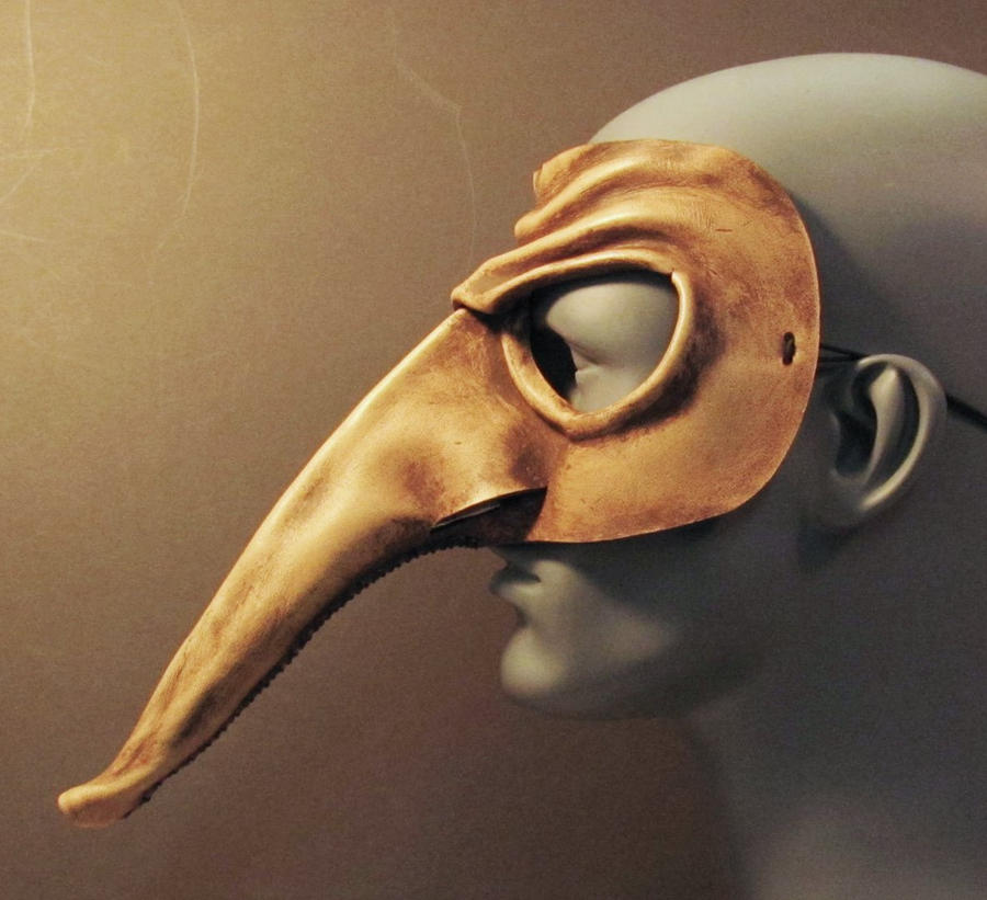

1. I selected these mask because of the extremely exaggerated nose, the long tall face and jaw-like structure and the dark hollowed out looking eyes.
2. The nose provides a large segment of space since it is such a long feature. Then the texture of the stone looking mask made me want to incorporate a texture like the plaid which I felt would be really cool to try and replicate. Then the lines of the jaw in last mask makes you check out the physical features of the mouth. as well as the value in the dark eyes.
4. My mask I gave the textured look with the plaid in that when you see that pattern you often think of the shirts and how it feels. Even shape in the eyes and mouth with the total blackness of them both. and the shape of the nose that is 3-D. Along with the line crossing through the entire face and into the empty face on the one side of the face.
4. Overall, I am very satisfied with this mask and the way it turned out from the original design in my head. I liked how my plaid pattern turned out on the top of the head. I definitely had a fun experience in creating this along with the three dimensional nose since I would never thing of creating a mask on a normal day.
Saturday, November 2, 2013
mod #10 video
1. I selected the African Art since we have to do a mask which I know Africans have used masks for ritual and religious events. The Buddhism video only to learn a little more about monk's and the way they live.
2. The key things I learned in the African video was how early art was primitive and child like for them, also either was perceptual or conceptual(most art was in this form). And the Buddhism film I found the pilgrims in east must walk around clockwise of the stupa or temple.
3. These videos are more informational on certain aspects of the readings, giving both depth and definition to certain parts in the chapters.
4. These were good films as they always are, giving us a more visual understanding of the readings and change from looking at words on a page and trying to imagine those things in our own heads.
Saturday, October 26, 2013
hands
1. Using my hands as a subject to draw was very fun. It was very simple to do but could be challenging depending on the amount of detail one is willing to go into can make this subject a great practice drawing for features.
2. For this project i used pencil since it was the only media of the two ready for me to use since I only have pencils and no art stuff.
3. It was very difficult to draw at the same skill level as my dominant hand could do. The hardest thing I felt was shading since you need to have a light touch to achieve different shades.
4. Overall I feel these are pretty decent depictions since you can get details of creases and wrinkles from the lines drawn in either of the hands.
5. I still wouldn't consider using my non-dominant hand since anything i would like to draw in the future I would like to have some what of a nice quality to it so I could show others.
Friday, October 25, 2013
mod #9 videos
1. I selected my first video Albrecht Dürer: Image of a Master because I use to study the language of German and was interested in learning a little bit about a German artist. The second video I choose was Leonardo da Vinci: The Mind of the Renaissance since we here his name so much in this world I figured I could try to learn more about the man.
2. The things I learned in the first video was how Dürer was such a great artist when it came to the details such as aging, landscapes, and reflecting the mood in his works. While the second video I was surprised how versatile Leonardo really was from being a painter, drawer, inventor, and even a scientist for his time.
3. These videos are related back to the readings by further explain two peoples works that contributed to the time periods they were living in and the style of art created. Such as Dürer and his mood created in the paintings which gave the viewer a certain feeling when he/she looked at it.
4. Overall I like the use of videos in this class as they add more insight to the readings by giving more pictures and examples of the style of art created in the certain readings and art in those chapters. This helps us students get another view point of the type of art and why it is the way it is other than what we are told in the readings.
Saturday, October 19, 2013
films mod #8
1. I choose the last video since we were talking about Roman architecture and art in the reading so I was interested in the differences the two may have had even though they lived so close together.
2. For the More Human Than Human I liked how they showed that people enjoyed the concept and basic forms of images more than the entire figure in the past. Next the Egyptians having a grid to base all of there human drawings on so that they were always equal no matter who drew the image. And in The Measure of All Things: Greek Art and the Human Figure I liked how the Greeks eventually focused more on the details of humans rather than a whole sculpture getting basic ideas of what was liked as they did in the past.
3. These videos relate to the text by showing how artist have changed there ways of viewing and sculpting things in real life forms. Like the two artist did in the book they made the images they created more realistic by placing the humans depicted into new and different positions than previously done. This was the same with sculptures in the videos, they often showed important features then moved to the finer details in humans.
4. In my opinion the films are always a good thing to add to a lesson. They add depth and more information than a text may be able to possibly say so that a reader can comprehend everything. So by having the videos it can help students whom aren't the best at reading, so by having another resource of information the students can learn easier possibly.
Thursday, October 10, 2013
mod #7 videos
1. In the Praire Style video, I like how they talked about one specific architect Frank Lloyd Wright and his talented eye for designing of homes and his style of a horizontal plan. In the second, The Science of Design I was surprised by how there were different ways of pouring concrete tin order to perform different tasks and weight capacities.
2. These videos relate back to the text by showing the different styles of architecture in this world we live in and how they are all made of the same materials but the way they are put together is what makes them unique.
3. I enjoyed these films, they gave me a deeper understanding of ideas that are possible for designs since i have been dreaming more and more of what me and my girlfriend want our house to look like. So seeing all these different styles and materials and the way they are put together is very unique and eye pleasing to many people since they have made designers and architects very popular.
4. I choose the first film because there is a house by me designed by Frank Lloyd Wright called Graycliff but I have never been there and didn't even know what it was, only seen signs for it along road. The second one looked interesting when i first checked it out because it dealt with skyscrapers and I have always found them fascinating. So if I could learn more about them and be part of my class it would be fun, which it was and got to learn more than i thought I was going to.
Friday, October 4, 2013
peer review
1.) http://courtneypepper421.blogspot.com/
http://mzaedtwohundred.blogspot.com/
2.) Overall I liked all the photos used in project #1 and even though it was a photo representing one particular aspect some of them still incorporated another feature as well.
3.) In my first bloggers review we both used the same art of welded steel and canvas which was 3-D which I feel a lot of people did whom visited the same gallery because it was rather unique. I can't say the same to my second review because she went to a different gallery so she had some completely different photos from me which was nice to see.
4.) I did like the unity of hands that the one student photographed because it should a community to me coming together for one sole purpose. That is the question I would ask is what the artist saw the hands coming together for?
5.) I do find reading reviews valuable because it gives me another opinion on my own work as well as things i could do better for next time. Just like in other classes online I see peer review as helpful critiquing to better myself as a learner and educator.
6.) These comments I didn't find helpful because they were more complements on my photography as well as agreeing on the same art work we choose from that art gallery.
mod #6
1.) The first video I was very surprised how sculptures chiseled at stone in order to sculpt it and the fact they didn't crack the stone either. Especially when using the power tools, if somebody applied too much pressure I feel as if they could crack and take off more stone than desired.
In the second video it talks about ceramics and glass. I was really shocked on how many different kinds of glass there was and how they are made. An example was the tempered glass which i thought had some type of plastic coating, but it was really made weaker so that it breaks into smaller pieces.
2.) These videos helped give me a better sense of understanding these sculpting materials that artist use rather than the pictures in a book. It isn't clear on how stone is produced and cut down to size like they showed in the video.
3.) By watching these videos it is a better interpretation of information rather than a book alone. The videos give viewers a deeper understanding of how these works of art are created. Yes, reading is a good way to describe things to people, but when you can show somebody I feel as though it makes a longer impression on them
Sunday, September 29, 2013
Art Gallery #1
A. The piece by Lee Bontecou which wasn't titled in 1960 made of welded steel, canvas, and wire had a big impression on me. First by its 3-D texture and medieval and beaten look it caught my eye just because it was unique and an out there kind of design that if one tried, they could replicate with his/ her own version.
A second work of art that impacted me was the various stacked plates that were a common theme in several pieces here. One particular piece was a collection by Glenn and Amanda Fuhrman which wasn't titled from 2006 made out of plastic. I found it unique because it was the point when i had noticed many other pieces of art also having staked plates as there art work was i thought was weird for several artist to design around the same concept.


A second work of art that impacted me was the various stacked plates that were a common theme in several pieces here. One particular piece was a collection by Glenn and Amanda Fuhrman which wasn't titled from 2006 made out of plastic. I found it unique because it was the point when i had noticed many other pieces of art also having staked plates as there art work was i thought was weird for several artist to design around the same concept.
B. The first artwork i had a connection with was the Dijonesque by Joseph Cornell in 1954 made of just a box construction it said. When i saw this piece it reminded me of how much i like older painted things with the weathered and chipped paint look to them as this piece had.
A second work I was connected to was the untitled folding table and chairs collection by by the Sarah Norton Goodyear Fund in 2007 made of paint, metal, and plastic. This piece really made me feel like a kid again to when i use to hide under tables during parties while playing hide and seek while the adults played card games above.
C. I would definitely like to know more about The Recycle Group by Andrey Blokhin and Georgiy Kuznetsov made of plastic mesh in 2013. I'm really interested in how they formed the mesh to create those images. Was it over hard molds that they laid the plastic on to cool in that shape or all by hand and eye?
The next artwork I'd love to know more about is Blue Velvet by Ed Moses in 2008 made of acrylic on canvas. This work is the style I would love to hang in my house so I wonder what drives him to create things like this and how he does it.
Saturday, September 28, 2013
My logo
1.) I thought it was enjoyable since I have always had this sort of design/ logo in my head for a tattoo for a long time now. This project maybe me think more about it and finalize a design which represented me and my memories best.
2.) I had the nickname B Squared since my high school days in track because I ran with my best friend who also shared the same first name as me and his heritage as being Irish influenced me in reliving his memory through this.
3.) The most important discovery I made while producing this logo was my bond to my best friend and the memories we had together.
4.) The most important thing I found in these extra resources was how important the logo is to a company and the product that will possibly represent that logo.
Saturday, September 21, 2013
Exploring art
1. I thought creating the Value Scale and Color Wheel were a fun an interesting way of understanding the different colors we see around us. It's kind of hard to look back now and see how we created different colors in the wheel by adding colors together, while the value scale was one color just different amount of the color put down.
2. I like the value scale best with a pencil because i grew up drawing and doodling in class with just a pencil. And with this project seen the different affects i was able to produce with that same type of pencil.
3. I felt the most important discovery with this art was the color wheel and how 3 (primary) colors can create many more colors when you combined them in certain orders.
4. To be honest there wasn't anything to new to me that i learned in these videos, I already came in with a basic understanding of the colors and primary colors with the things you can do with them and also how charcoal or a pencil can create different values.
Sunday, September 15, 2013
Reflection
During my time as a photographer, i wasn't to impressed with my skills as at photo taking and possibly the quality of my camera. It wasn't until I took the photos off my camera and onto the computer was when I really say the details and clarity of the photos. It was at this point when I really became impressed with my work and saw the potential my camera really had.
I really had fun with this experience, me and my girlfriend both did as a matter of fact. Both exploring nature and the resources around us which lead us to explore with our cameras. The craziest, spooky, and chilling part of this experience by far was once we took all the photos and went through them to create the slide show. Here as we looked at several photos of the railroad tracks was when my girlfriend discovered in one photo a man about quarter mile away from us in the photo. When she saw that we both got the chills knowing he never said anything or the fact we never heard or saw anybody else around since we weren't near any homes an half mile from the road. So seeing that later that day in a photo knowing how close someone was to us an we didn't even notice was a scary thought that i gained from this artistic journey.
http://s876.photobucket.com/user/BrettColling/slideshow/
Friday, September 13, 2013
color theory and emotional effects
1.) Color has its affects on emotions based on what colors and styles are used by the painter. They can convey harmonious feelings, soft, erotic, anger, and much more. All this is based on how the artist lays out his/her work using different colors.
2.) The theoretical aspect of color that most intrigues me is how painters worked to earn their way into heaven. Which most paintings were done for the church or religious purpose conveying some sort of message. This i found interesting because what about all the people whom wanted to paint but just lacked the creativity, passion, and skill that popular artists had.
3.) The biggest impact on me was how the paints were made from different odd world items and crushed down with three other ingredients. Also how painted by trial and error and even when they hated or disliked their work they kept painting over the old until they liked it rather than start over from scratch.
4.) The impact which the second video had on me was how many paintings which are famous were based on religion alone and that they emitted the most emotions. Goya also had an affect on me with how intense his works were even when painting such high ranking officials he still made them look fearful.
Friday, September 6, 2013
module #2
1. The article talks about the different styles of art an d how the brain perceives them based upon the artists styles used in the art. While both videos talk about the brain and how visual stimulation can change how the brain thinks and works. They also scanned the brain to see how different codes of art activate the brains different areas.
2. I feel Francis Hutchese of the 18h century was a great philosopher dealing with aesthetics. He believed that beauty was controlled through an external sense which was controlled by the inside that registered was pleasing to a viewers eye.
3. Changeux and Ramachandran had very great views of aesthetics and art by the amount of work they put in to understanding the brain and how it is affected by art. the most interesting thing was when they talked about the codes in art which gave the brain different feelings based upon the type of art was being viewed.
4. These readings and videos all relate to the text because of there talks on how art holds the power to please the eye, aesthetically. The eyes are where art is first interpreted and then the brain creates the feelings that the eyes see throughout the rest of the body.
5. Having the reading and videos along with the text really helps to create a deeper understanding of the text by having different views on the subject so that one can formulate their own conclusion of aesthetics and art. If we only had a text to learn from we would have to understand everything we were reading instead of getting different forms of ideas from credited scholars.
Wednesday, August 28, 2013
First Blog about Art
1. The process for creating the Gmail was very simple with the step by step directions.
2. Well i'm already learning how to blog, and as of right now i don't see any use for it after this course. But i can't wait to learn a lot more about art and the different styles.
3. I'm alright with the online course, it's just the reading aspect and understanding it all with out seeing different views so when answering questions and quiz my ideas wont be way out there.
Subscribe to:
Comments (Atom)