Saturday, November 30, 2013
project 4 review
This project was very interesting and challenging at the same time. Trying to find art which represents that of principles and elements in many different pieces. Even though it was hard, I thought it was fun to see just how different things have become from art in the past. Also learning the different forms that artist have used in their art work. For example, I really was surprised to see the paper cut up and pulled apart with varying colors.
Saturday, November 23, 2013
final videos
1.) In the first video, i thought it was very interesting in how lowbrow art was really flourished through flyers and CD cover artwork. The second video was cool on how they built art into the museum exhibits instead of brought in separately to be displayed. The next video talked about the bones of native Americans which they could tell stories and find diseases based on traces left on bones and artifacts. Finally, I thought was very fascinating is the amount review that goes into artwork that can possibly be included into a museum.
2.) Yes, These videos do relate to mine like the fourth video on how I will have to review the different possible art pieces that I will include in mine or not. Even the first video, some pieces I will choice may exemplify this style of art just by my taste in what I see.
3.) These films definitely help in the visual understanding of each. They can really help students learn with all the reading they have to do for other classes today. So like I always say, videos for information and learning purposes is always a great tool to helping people learn in the world we live in today with all the technology.
Friday, November 15, 2013
mod#12 videoo
1.) I choose the first video Abstract Expressionism and Pop: Art of the ’50s and ’60s since i find abstract art very unique and beautiful in some essences. By watching this video I can see a variety of other styles by different artist and their take on art. The second video I choose was Isamu Noguchi: The Sculpture of Spaces since I have always loved seeing sculptures out in public blended in around in the surroundings.
2.) The key concepts in the first video was the use of colors, not exactly in great detail, but rather to bring out the important factors in the art work. This brings the eye of the viewer to the main point in the particular part in the piece with which the artist wants to stick out the most. The second film focused on the space of areas with which people could use. Like the garden, even if it's not the ideal area to have one, people can work with what they're given to create something wonderful.
3.) These readings helped tie into the readings by the concepts that were conveyed in them. Abstract and space are both concepts in the readings with these videos helps get the viewer a greater understanding by visual needs instead of text readings and understanding.
4.) In the long run, these films are always helpful to give readers a better understanding if adolescents aren't the strongest at understanding readings.
Sunday, November 10, 2013
art gallery #2
Step 1
1.) The title for the exhibit was Burchfield.
2.) Casting of works along with the space with which he created his art work in.
Step 2
1.) The lighting i thought was dim and kept low to give that older in time feel to the art works.
2.) White was the olor used on the walls, but just seemed darker because of the lighting.
3.) The architecture was just normal walls, except for one which made it seem like the viewer was looking through a wall of his studio.
4.) The movement was paced out evenly i thought, well spaced out giving viewers time to take in each piece and not feel rushed to view the next.
Step 3
1.) The art work was organized by the different artists.
2.) Art works are similar because of the material with which they were crafted from.
3.) The art works are different because of the artists ideas, thoughts, materials, and ideas conveyed in the pieces.
4.) Some of the works are framed in wood, but three dimensional often rested on some sort of base to be displayed.
5.) Artworks are identified with a little tag next to them with there title, artist, material, and when they were created.
6.) The artworks proximity is probably ten feet apart, giving you a more open space to view at a steady pace and not rushed by others.


4.) Overall I liked the experience of looking at things in a different way and how the space could also affect a piece of art as well.
1.) The title for the exhibit was Burchfield.
2.) Casting of works along with the space with which he created his art work in.
Step 2
1.) The lighting i thought was dim and kept low to give that older in time feel to the art works.
2.) White was the olor used on the walls, but just seemed darker because of the lighting.
3.) The architecture was just normal walls, except for one which made it seem like the viewer was looking through a wall of his studio.
4.) The movement was paced out evenly i thought, well spaced out giving viewers time to take in each piece and not feel rushed to view the next.
Step 3
1.) The art work was organized by the different artists.
2.) Art works are similar because of the material with which they were crafted from.
3.) The art works are different because of the artists ideas, thoughts, materials, and ideas conveyed in the pieces.
4.) Some of the works are framed in wood, but three dimensional often rested on some sort of base to be displayed.
5.) Artworks are identified with a little tag next to them with there title, artist, material, and when they were created.
6.) The artworks proximity is probably ten feet apart, giving you a more open space to view at a steady pace and not rushed by others.

Artist: William Keyser
Title: Pretzel II
Media: gum wood
Date:2013
Description- To me this piece reminds me of a center piece for a dinning table and since I like wood work so much it makes me want to create something just like it on my own.
Formal Analysis- This piece has line, shape, and space all in it because of the straight but different layers in the piece itself.
Interpretation- The artist probably wanted to show how nature is wrapped around itself and always continuing no matter what way it is forced in.

Artist: Mitchell Messina
Title: #7 Extension
Media: clay, wood and pigment
Date: 2013
Description: A person is holding a ladder which could possibly be to support others.
Formal Analysis: line is the biggest one in this based on the long ladder which draws the viewer to the person on top.
Bracketing: This piece reminds me most of a ladder because it is the largest part in it.
Interpretation: I feel as if this work is to symbolize the person helping others get to the top and be all they can be.

Artist: Dan Mirer
Title: Knob Top Jars
Media: Blown glass and silver foil
Date: 2011
Description: to me, these pieces of glass mostly resemble a water drop.
Formal Analysis: Shape is a great one with the two spheres and straight part connecting the two.
Bracketing: This piece reminds me of a rain drop from the beging, like one in a pool of water.
Interpretation: I feel the artist was trying to show the union of two seperate pieces together as one.
4.) Overall I liked the experience of looking at things in a different way and how the space could also affect a piece of art as well.
Saturday, November 9, 2013
mod #11 video blog
1.) I selected these two videos because of there relation to the two topics in the text which interested me the most. I felt that both the Surrealism and Expressionism were great sections of this chapter and could relate to the most in my visits to art galleries.
2.) In the Dada and Surrealism it was interesting with the abstract touch to all scenes were unique and creative, also the signs in them had thought and emotions given to the viewers. For the Expressionism, colors and emotions were the emphasis on paintings. While they also payed attention to detail especially using dark and light areas to bring out things.
3.) These videos relate to readings by expanding the information read in the small parts of it in order to give the reader a better interpretation. Also the displaying of more art that can help explain the style of art being talked about in each section.
4.) I felt these films were pretty decent, little length to keep some peoples attention span because of the amount of information in them. However, they are still a great way for students to get a better grasp of some styles they may find very interesting to them.
Sunday, November 3, 2013
masks

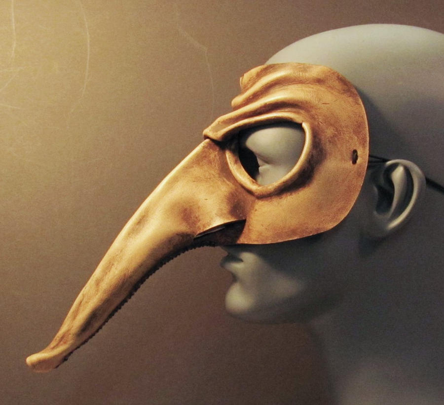

1. I selected these mask because of the extremely exaggerated nose, the long tall face and jaw-like structure and the dark hollowed out looking eyes.
2. The nose provides a large segment of space since it is such a long feature. Then the texture of the stone looking mask made me want to incorporate a texture like the plaid which I felt would be really cool to try and replicate. Then the lines of the jaw in last mask makes you check out the physical features of the mouth. as well as the value in the dark eyes.
4. My mask I gave the textured look with the plaid in that when you see that pattern you often think of the shirts and how it feels. Even shape in the eyes and mouth with the total blackness of them both. and the shape of the nose that is 3-D. Along with the line crossing through the entire face and into the empty face on the one side of the face.
4. Overall, I am very satisfied with this mask and the way it turned out from the original design in my head. I liked how my plaid pattern turned out on the top of the head. I definitely had a fun experience in creating this along with the three dimensional nose since I would never thing of creating a mask on a normal day.
Saturday, November 2, 2013
mod #10 video
1. I selected the African Art since we have to do a mask which I know Africans have used masks for ritual and religious events. The Buddhism video only to learn a little more about monk's and the way they live.
2. The key things I learned in the African video was how early art was primitive and child like for them, also either was perceptual or conceptual(most art was in this form). And the Buddhism film I found the pilgrims in east must walk around clockwise of the stupa or temple.
3. These videos are more informational on certain aspects of the readings, giving both depth and definition to certain parts in the chapters.
4. These were good films as they always are, giving us a more visual understanding of the readings and change from looking at words on a page and trying to imagine those things in our own heads.
Subscribe to:
Comments (Atom)